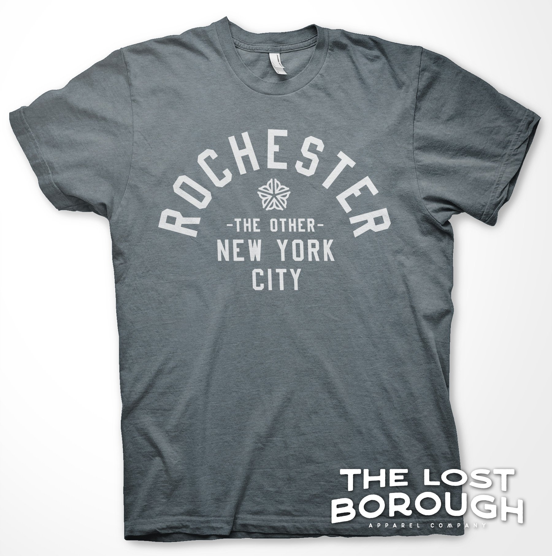
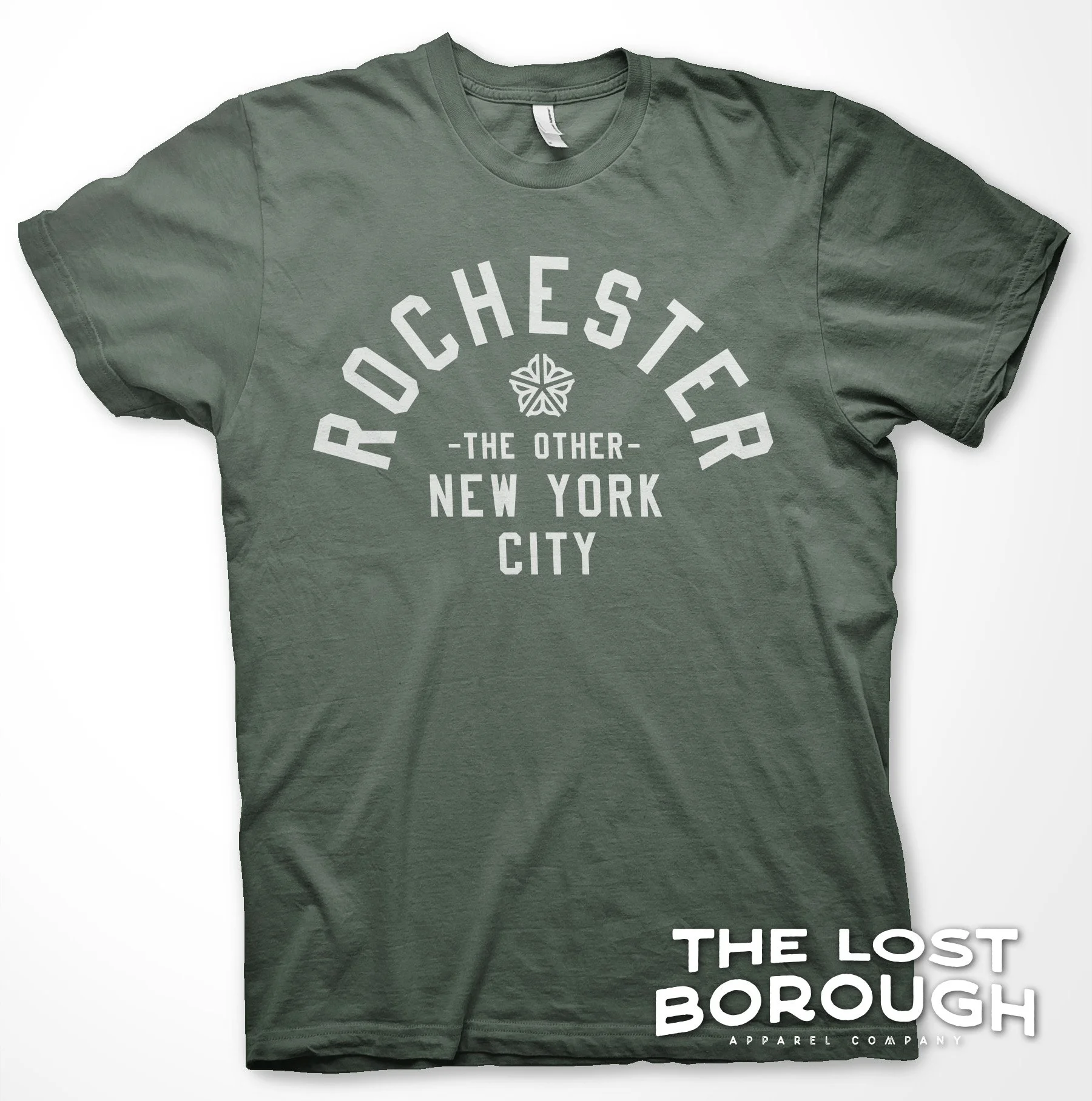
 Image 1 of 3

 Image 2 of 3

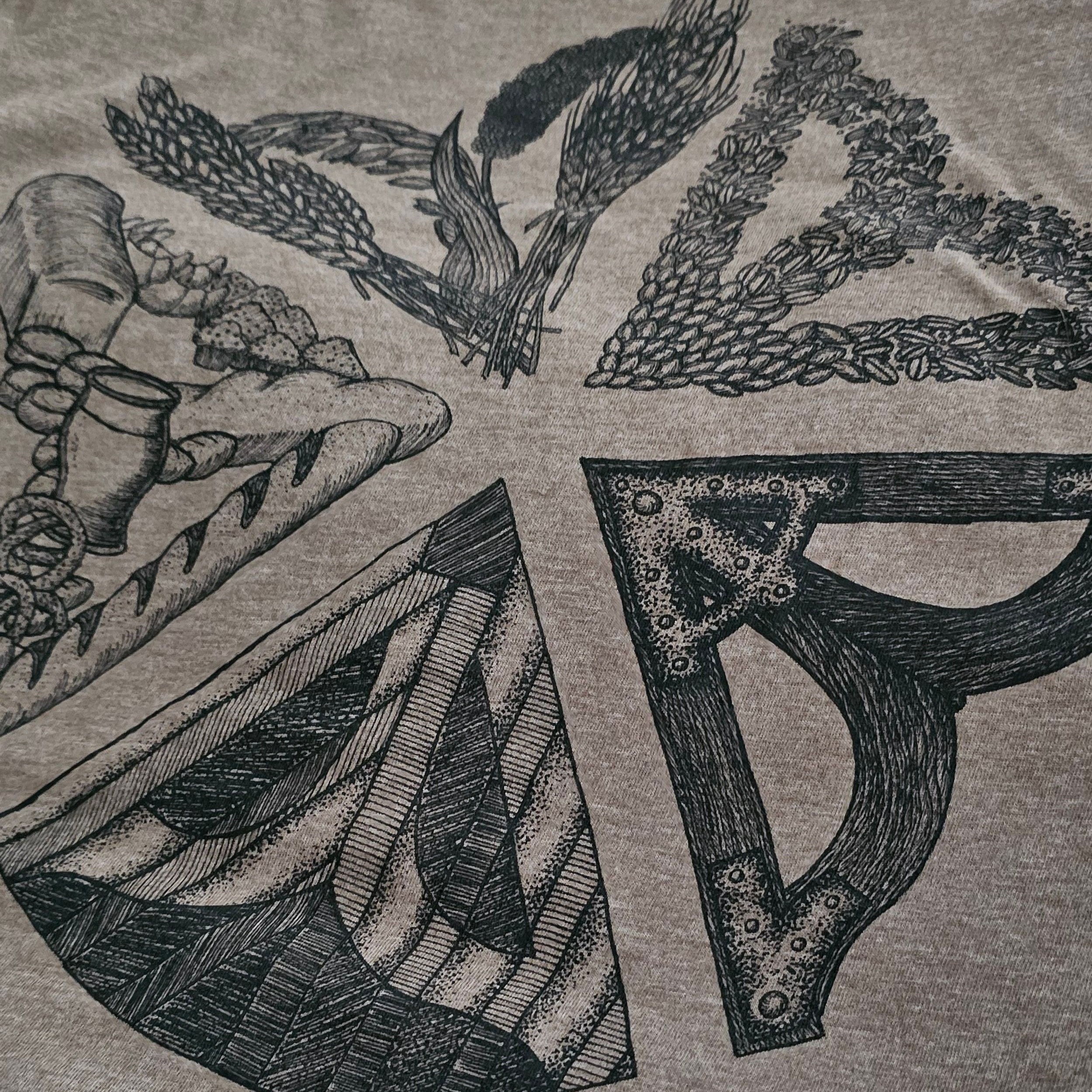 Image 3 of 3


Flour City Logo
Land speculators and pioneers drawn to the Genesee Valley shared a similar vision of prosperity, eyeing a unique natural resource, easily positioned for industrial potential: the Genesee River. More directly, they saw the might of the original four waterfalls, and quickly went about creating raceways and mills (even blasting away one of the waterfalls in the process). These mills fashioned lumber, iron, textiles, and other materials for commerce and export. Chief amongst those exports, was flour. Cereal grains from all over the region made their way by ox, cart, barge, and barrel to High Falls for grinding into flour. The small city quickly gained an international reputation for it’s production, reaching even the tables of the English Royal Family, and gained the moniker: The Flour City.
To recognize this historic prestige, the City Of Rochester commissioned a logo in 1970 to represent itself in official capacity, leading to one of the most recognizable symbols in the region. To recognize the history culture and pride of Rochester, this featured design is an illustrated circle of life for cereal grains: harvested plants like barley wheat rye and millet were reaped and collected, the kernels were separated and transported to the mills, the waterwheel would convert the river’s kinetic energy, the gears and driveshaft would move the grist stone, and process that grain into flour for bread biscuits rolls pretzels and beer.
Word spread of the mid-atlantic region being known as the nation's breadbasket, and Rochester was integral to that reputation.
Unisex Cut:
Shirt Color: Heather Army Brown
Shirt Type: 50/50 Polyester Cotton


